The case in a nutshell
Humbee approached Miyagami to help solve a number of design challenges:
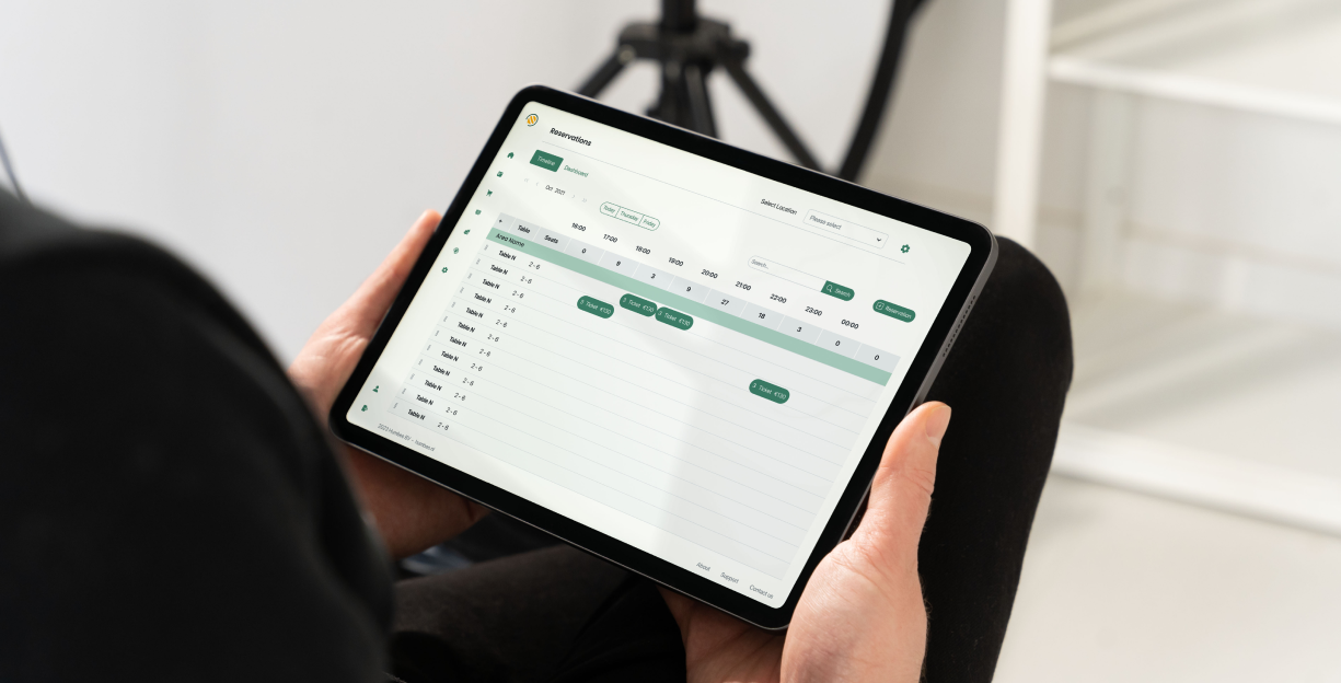
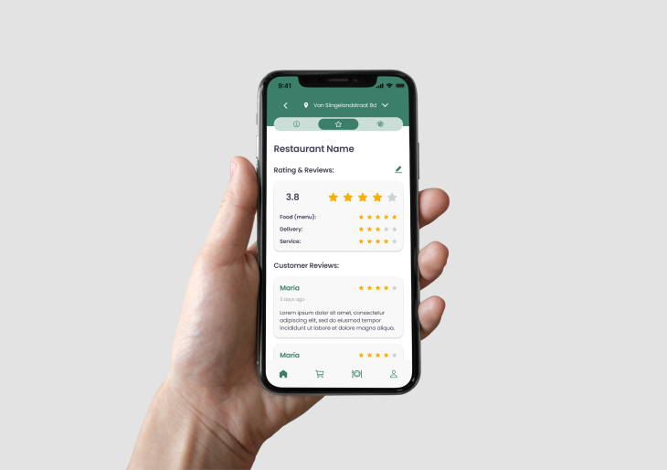
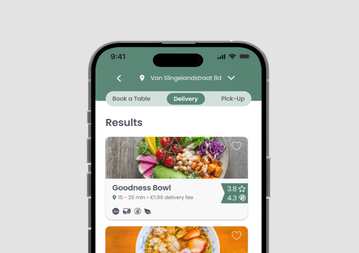
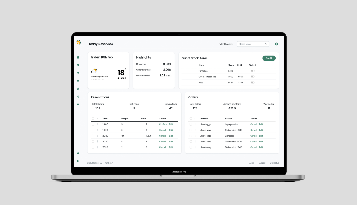
- We designed the new web app, website and booking widget based on Humbee’s pre-existing brand identity.
- We also provided Humbee with a high-fidelity interactive web design prototype of the products.
Show filters
The client
Humbee is a platform where consumers can find restaurants that have a focus on sustainability. Users can order food for delivery (or pickup) and book a table at the restaurant through the app or website. Humbee is also building an academy where they can offer restaurants guidance on how to adopt more sustainable practices. One of Humbee’s key aims is to increase transparency in the food and restaurant industry regarding sustainability practices. This enables customers to choose companies that genuinely embrace sustainability as opposed to those that resort to greenwashing. They also want to tackle the lack of education or knowledge in the industry about sustainable practices and help businesses to improve or find out how to get started in this process.
The challenge
Humbee already had a brand identity, but the website and app were not aligned with this so the visual identity was inconsistent. This can have a negative effect on user experience and damage brand awareness and reputation. Furthermore, the app interface was not fully developed and a number of important elements did not provide a good user experience. Humbee decided to discard the pre-existing app and start from scratch. They partnered with Miyagami to design a complete app that would consider all the tasks that their users needed to fulfil through the app and the website. They also needed a website widget to book a table at restaurants. As well as providing a superior user experience both platforms must also align with Humbee’s current brand identity.


